
| Cookie | Duration | Description |
|---|---|---|
| _ga | 2 years | The _ga cookie, installed by Google Analytics, calculates visitor, session and campaign data and also keeps track of site usage for the site's analytics report. The cookie stores information anonymously and assigns a randomly generated number to recognize unique visitors. |
| _gat_gtag_UA_60175542_1 | 1 minute | Set by Google to distinguish users. |
| _gid | 1 day | Installed by Google Analytics, _gid cookie stores information on how visitors use a website, while also creating an analytics report of the website's performance. Some of the data that are collected include the number of visitors, their source, and the pages they visit anonymously. |
| Cookie | Duration | Description |
|---|---|---|
| _fbp | 3 months | This cookie is set by Facebook to display advertisements when either on Facebook or on a digital platform powered by Facebook advertising, after visiting the website. |
| fr | 3 months | Facebook sets this cookie to show relevant advertisements to users by tracking user behaviour across the web, on sites that have Facebook pixel or Facebook social plugin. |

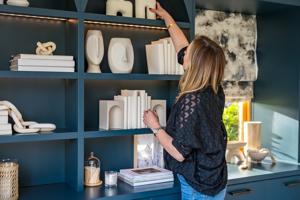
Download my free guide to help you navigate those tricky design decisions!
How to Choose the Right Paint Colour for Every Room
Make Confident Colour Choices with These Expert Interior Design Tips
Choosing the right paint colour can be daunting, with thousands of options and so many factors to consider, where do you even begin? As an interior designer, I’ve assisted numerous clients in selecting the ideal colour scheme. Here’s how to make confident, intentional decisions for each room in your home.
Understand the Room’s Purpose
Begin by thinking about how you want to feel in the space. Each colour has a unique effect on mood and energy:
Green
Red
Purple
Yellow
Blue
Factor in Natural Light
Light changes how paint looks. Consider:
💡 Tip: Always test paint samples on multiple walls and observe them at different times of day.
Start with a Fixed Element
Choose a colour that complements what’s already in the room, like flooring, cabinetry, or a statement piece of furniture.
Ask yourself:
Matching undertones helps everything feel harmonious.
Use the 60-30-10 Rule
A classic interior design ratio:
Choose a wall colour that plays nicely with the secondary and accent tones.
Don’t Be Afraid of Neutrals
Neutrals aren’t boring, they’re timeless and versatile. Add personality with textures, art, and accents. Some of my favourite go-to neutrals:
Test More Than One Colour
Get sample pots and paint swatches directly on the wall. Live with them for a few days. See them in morning, afternoon, and evening light. What looks creamy in the store might turn peachy at home.
Use Tools & Technology
Apps like the Dulux Visualiser App let you upload photos and preview paint on your walls. Super helpful for narrowing choices before testing samples
Final Thought: Trust Your Gut (and Your Eyes)
Paint is one of the easiest things to change in a room. Don’t get stuck in analysis paralysis, go with what feels right and fits your style.
Whether you’re picking paint or planning a full redesign, I’m here to help. Reach out anytime for expert guidance!
Angela x